Simple shapes, bold typography, and a flexible color palette. An identity that is easy to recognize, and easy to apply everywhere.
A clear system designed for packaging, labels, and social content.
PAVO
Modern, light, and confident. A clear system designed for packaging, labels, and social content.
The brief, in one line
A modern, light identity that is easy to recognise, and easy to apply to packaging, labels and social media.
What we made
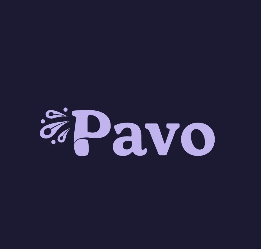
- A logo: the name in bold type with a small splash mark, shown in lilac on navy.
- A construction grid for the logo.
- A palette of lilac, yellow, teal and navy, with simple organic shapes.
- Designs for a shopping bag and for food container sleeves.
- Labels and cards with the line “Nourish to flourish”.
- Instagram post designs with fresh lemons and vegetables.
Formats and channels
- Logo and identity system.
- Packaging and labels.
- Instagram posts.
Why it matters
A food brand is seen on a bag, a shelf and a phone screen, often for a second. A clear logo and a small set of colours make it easy to spot in all three.
Simple shapes and a flexible palette let the team make new labels and posts without breaking the look.